



You will meet Japanese calligraphy before you go looking for it. Calligraphy is on the plaque above a temple gate, on the cloth curtain at a restaurant door, on the scroll in the alcove of a room you have been shown into. In each case you cannot read them.
The practice has a name in Japanese — shodo, the way of writing — and the advice a visitor is usually offered is to learn the strokes. That is a long road, and it is not the one that helps here. What helps is knowing what the calligrapher was deciding, because those decisions are visible even when the words are not.
This guide answers three questions, in that order: how Japanese writing came to look the way it does, what the writer is deciding while the brush moves, and how to read a sheet without reading the words. Two further sections cover where brushed writing turns up once you can see it, and where in Tokyo to stand in front of some. It is not a how-to, and it is not a general introduction to the craft — history enters only where it explains what is in front of you. The paper it is written on belongs to a craft of its own, but what happens on it here is particular.
One thing to settle at the start, because it changes how you look. Illegibility is not a foreigner's problem. The Metropolitan Museum of Art, introducing a 2013 exhibition of Japanese brush writing that spanned the eleventh century to the present, puts it plainly: the works "demonstrate that beauty was often the supreme motive in the rendering of Japanese characters, even at the expense of legibility." Not being able to read it is, in part, the intended condition.
Which room, not which museum — how to read a display schedule before you go.
Japanese Calligraphy Is Not Chinese Calligraphy in Another Language
The two traditions share their equipment, and one descends from the other, and they are still not the same art. The Met describes the inheritance carefully: Japan "inherited from China a fascination with the artistic potential of inscribing characters with flexible animal-hair brushes while developing its own distinctive system for rendering poetry and prose written in the vernacular."
Two halves to that sentence. The brush and the fascination came from somewhere else. The system for writing Japanese did not.
Kanji Came First, and Came as Someone Else's Writing
Chinese characters — kanji — arrived as a finished thing, built to write a different language. They were not designed to write Japanese, and Japanese is not built like Chinese.
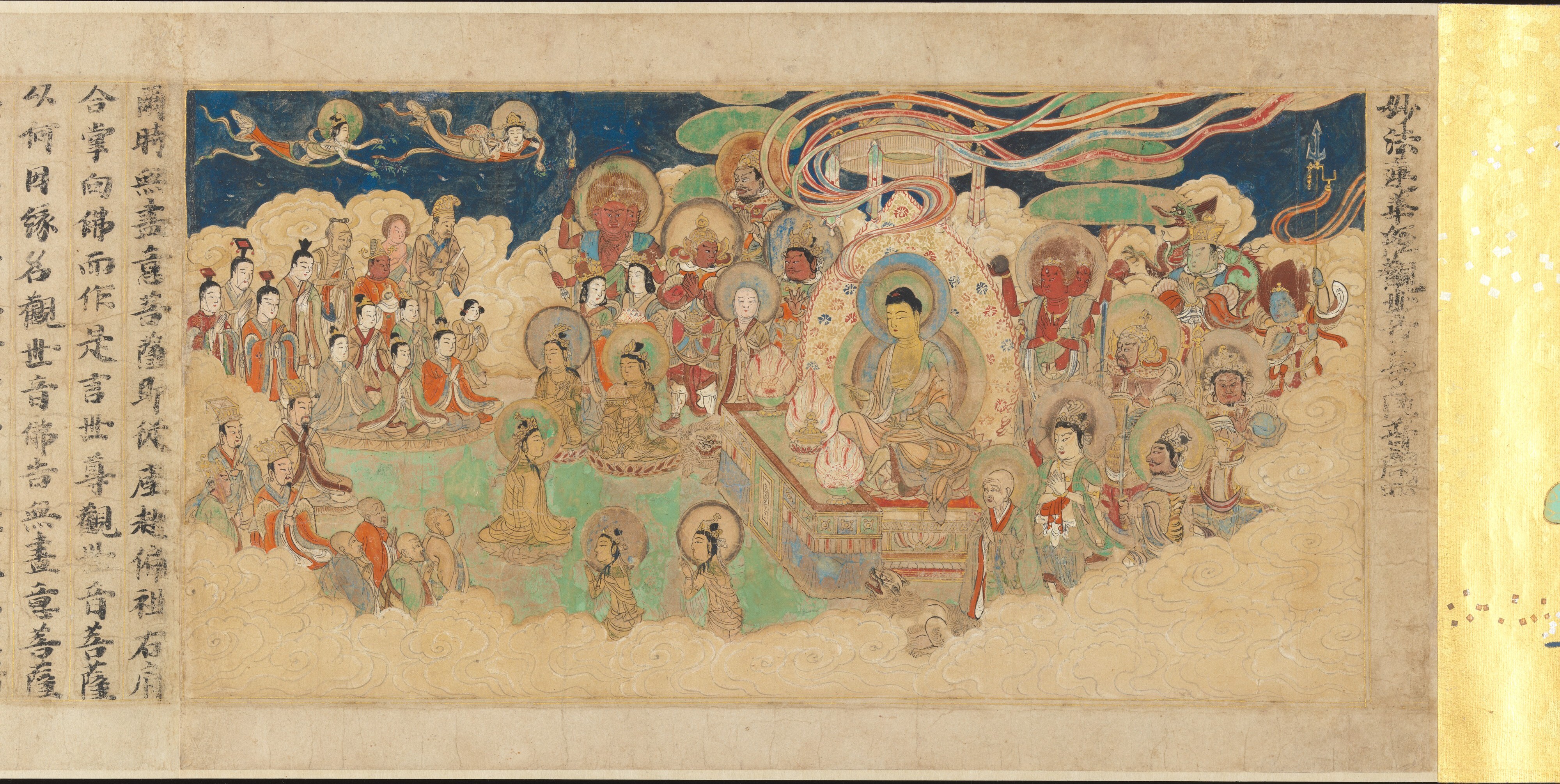
One thing is worth knowing about anything old you are likely to see: Buddhist text copied out by hand is a category of its own. The Met's exhibition gave it a section, under the heading "Inscribing Magic: Sacred Buddhist Texts." What follows is later than the object in the next section, because what survives does not arrive in tidy order. The Met holds a scroll of Chapter 25 of the Lotus Sutra whose calligrapher is named — Sugawara Mitsushige — and whose date is on it: 1257. The Met describes the scroll, citing the calligrapher's inscription, as one that "was modeled after a Song printed book of 1208, which in turn was based on a painted scroll."
Copied, by its own account, from a printed book that was itself based on a painting — and the museum adds that "[n]o Chinese model for this scroll has been discovered, but many similar printed versions from later periods are preserved in China and Japan." The line of descent is not in doubt; the particular parent is missing. And the Met names the man who wrote this one out.
That mismatch — a language written with characters built for another one — is what the next script was invented to solve.
Kana: The Script That Made a Japanese Line Possible
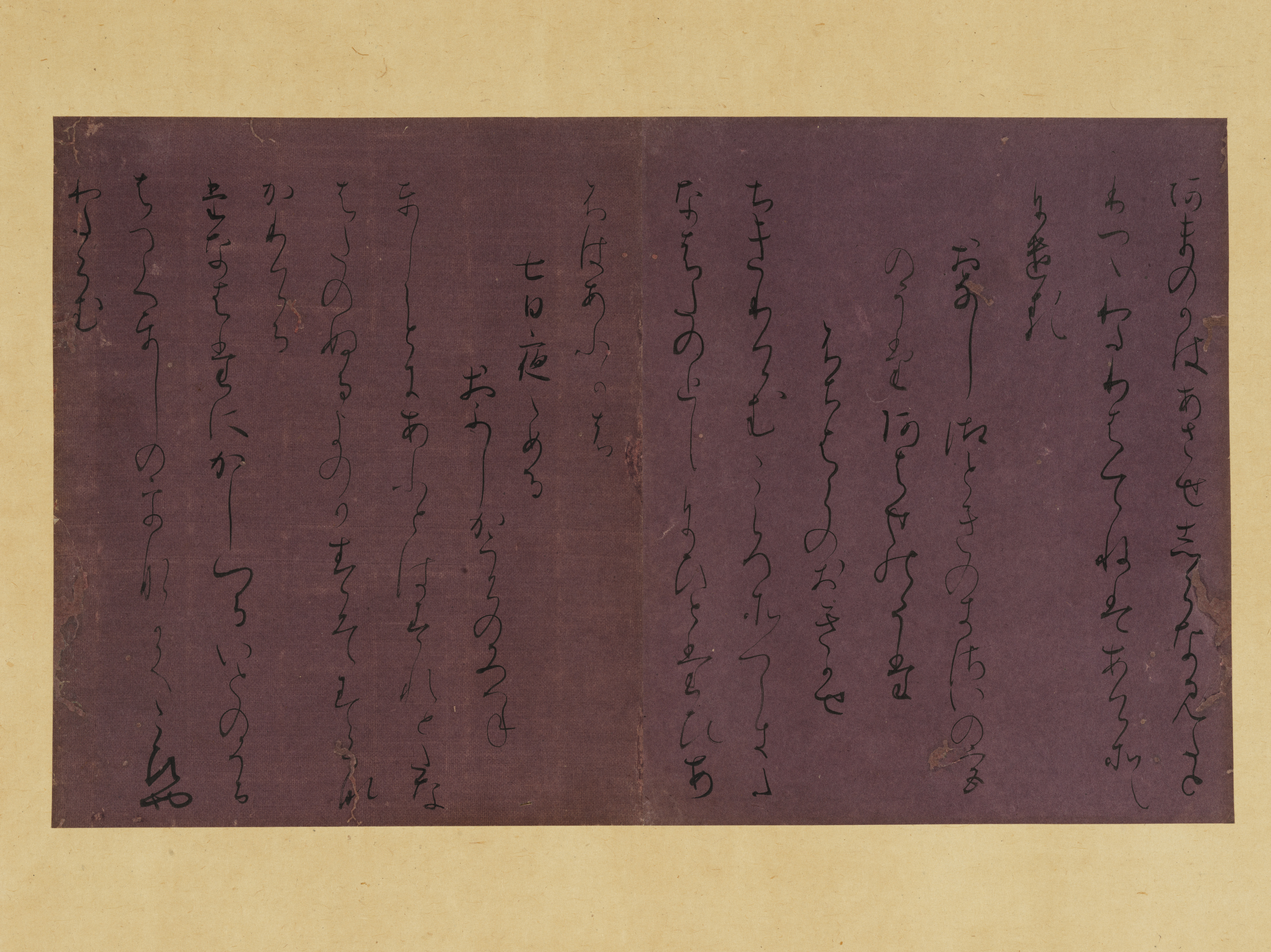
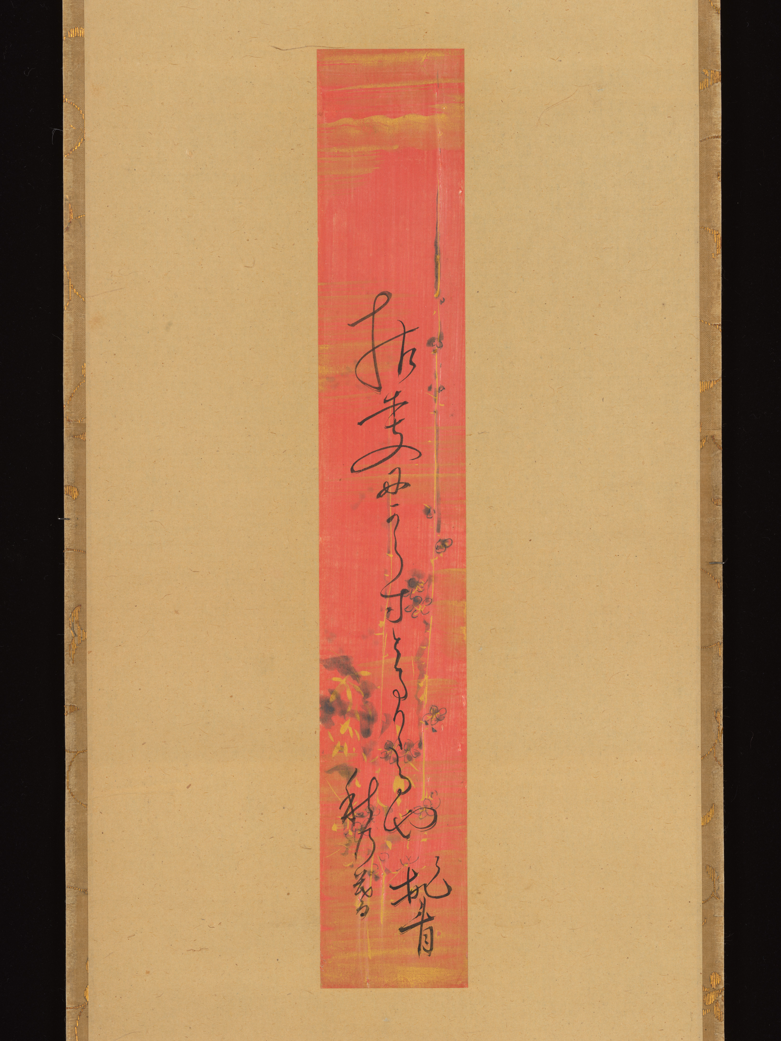
The Met's own phrase for what Japan developed is "its own distinctive system for rendering poetry and prose written in the vernacular." It does not name the script on that page. Where it does name it is in the entry for an object: the eleventh-century sheet above is "inscribed in an elegant, flowing kana (phonetic writing) script."
Kana are phonetic, and they were developed in Japan for a language the imported characters did not fit. That is the substantive difference between the two scripts — a fact about the writing system rather than about how any one sheet has been brushed.
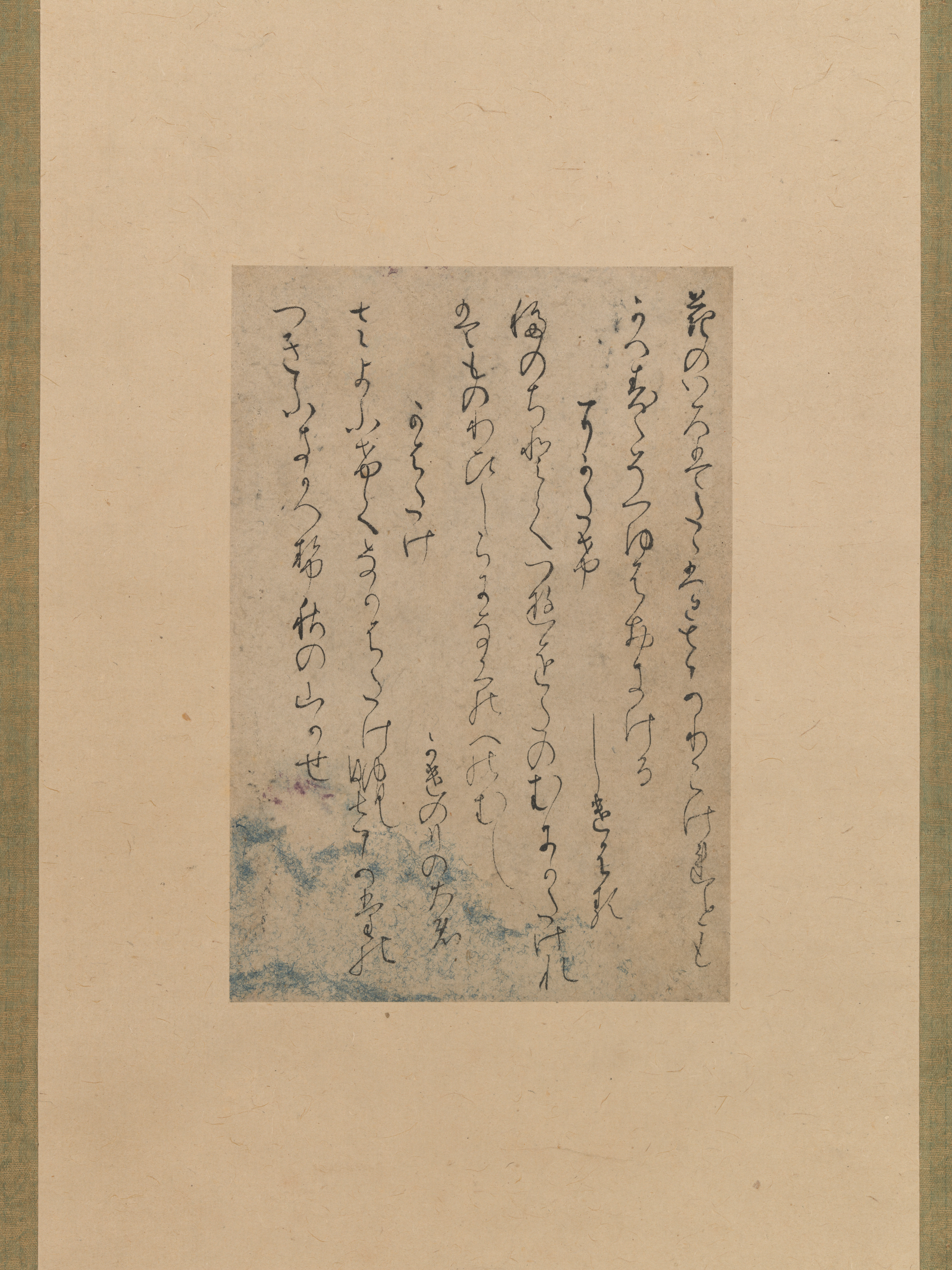
The Met holds an eleventh-century example, and the museum describes it in terms worth borrowing. Four poems from the Sekido version of the Kokin wakashū, traditionally attributed to Fujiwara no Yukinari, are "inscribed in an elegant, flowing kana (phonetic writing) script," and the sheet "was long esteemed as an exemplary model of ancient court kana calligraphy."
Read that entry twice. Flowing is the museum describing this sheet; script is the museum naming which writing system is on it. They are two different kinds of statement, and keeping them apart turns out to matter, as the third section explains.
One question worth asking of anything brushed is not what it says. It is what the writer was deciding.
What a Calligrapher Is Deciding While the Brush Is Moving
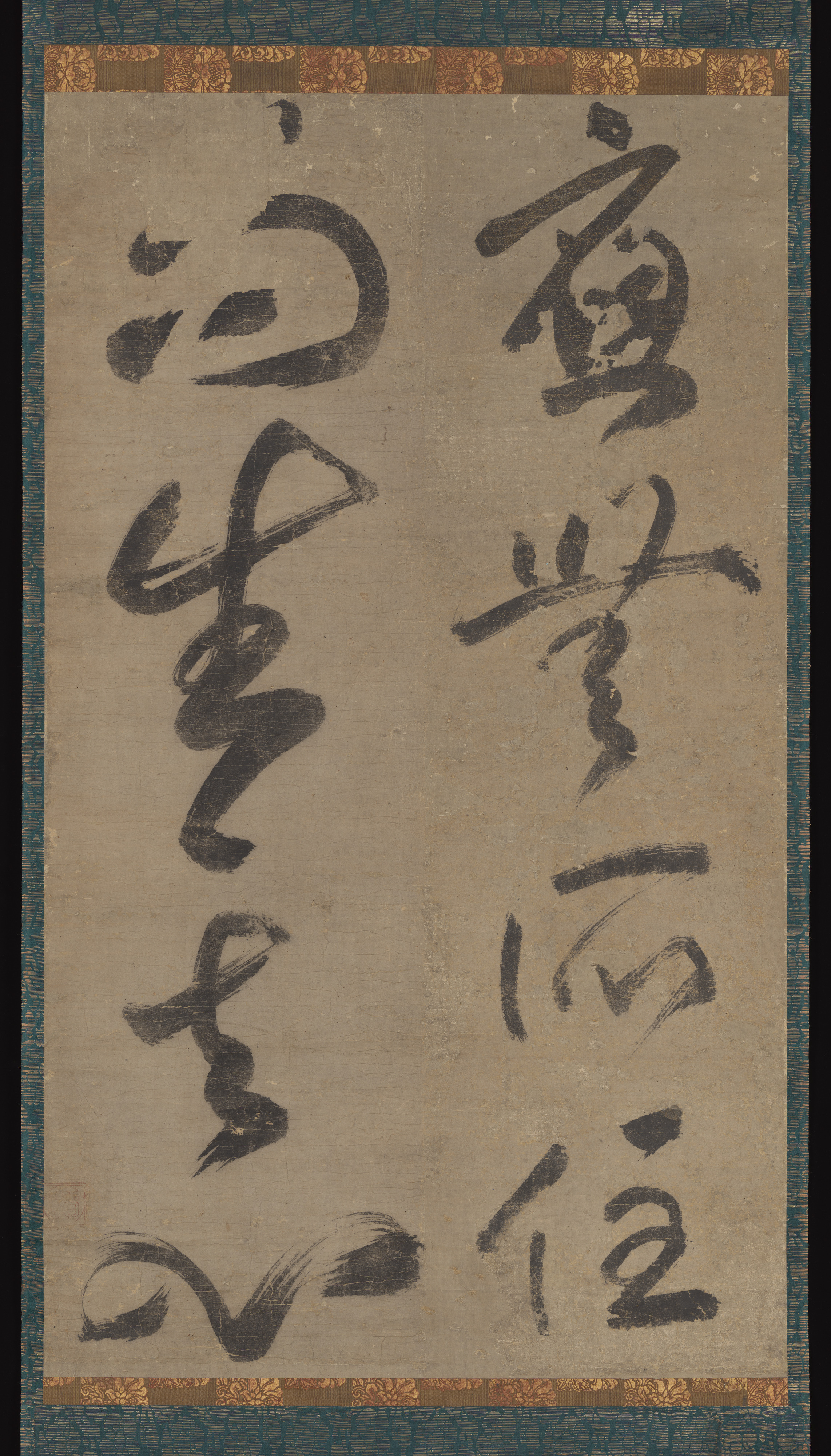
Describing what was on view in that 2013 exhibition, the Met set out a list of variables rather than a list of virtues: "the original gestural movement marked in each work—the applied pressure, speed, and rhythm that are said to reflect the artist's state of mind."
Pressure, speed, rhythm. None of those is about accuracy, and all of them are things a viewer can look for rather than know. The rest of this article is a way of doing that.
Sumi: Ink That Is Not Black
The ink has a name of its own — sumi — and "black on white" turns out to be the wrong picture to walk in with. The Met's own catalogue lines say so before you have looked at anything. The eleventh-century kana sheet is listed as "ink on dyed paper": the ground is coloured, so the sheet was never a white one. The 1257 sutra scroll is listed as "Handscroll; ink, color, and gold on paper" — ink is one of three materials on it.
On a brushed sheet the ink is not one value either. Some passages sit solid and dark; others thin out into grey, or break open into streaks of bare paper where the brush has left less behind. A stroke that starts saturated and ends dry is doing something a fully loaded brush does not do, and you cannot tell from the outside which it was — a brush runs out, and a dry brush is also a thing a writer chooses.
So look for where rather than why: where the ink runs out, and whether it runs out at the same point in each column. That is an observation rather than a reading, and a column that dries at the same place every time is at least evidence of a habit rather than an accident.
The Space You Are Not Looking At
It is easy to look at a piece of calligraphy and see only the marks. The marks are not all of it.
The rest is the interval: between one character and the next, between one column and the next, between the writing and the edge of the paper. Those intervals are not fixed properties of the work, either. The Met catalogues its eleventh-century sheet as "two pages from a booklet mounted as hanging scroll" — pages made to be turned, later cut out and hung flat. Whoever did that decided how much space would sit around them, at some point after the writing was done.
Two intervals are specific to writing rather than to pictures, and they are the ones to look at: the gap within a column, and the gap between columns. Both are worth noticing before you look at a single character, because both are legible from across a room while the characters are not.
What those intervals do to a viewer is not something to decide from a photograph. Stand in front of two sheets by different hands and the difference in spacing is one of the things that separates them.
Reading Shodo Without Reading the Words
Those decisions leave marks on the sheet, and two kinds of mark are readable standing in front of a case. Neither requires you to identify a single character.
Follow the Brush: Order, Speed, and Where It Left the Paper
A brushed line is a record of time. It was made in one direction, at a speed that varied, and it left the paper at a particular moment.
Find the two ends of a stroke and decide which one the brush landed on first. The blunt, thick end is usually where it went down; the end that narrows, or frays into separate hairs, is usually where it came off. Then travel from the first to the second. Then do the same for the next. What you are reconstructing is the order of events — the sequence the hand actually moved in, which stays in the finished sheet.
Then look at what changes between strokes. Where one stroke is markedly faster or heavier than its neighbours, the hand did something different at that point. What it means is not something to settle from the sheet, but noticing that it happened is the part that does not require reading.
How Joined the Writing Is, and What That Tells You
The second thing is visible without any knowledge at all: whether the ink carries from one character to the next, or whether the brush leaves the paper between them. That is a real property of the sheet.
What it means is where visitors go wrong, and it is worth seeing why. Look again at how the Met describes its eleventh-century sheet: "inscribed in an elegant, flowing kana (phonetic writing) script." Three things are bundled into one phrase — a judgement (elegant), a description of the writing (flowing), and a classification (kana). A catalogue can do that because a curator knows which is which. A visitor reading it quickly comes away with an equation: flowing equals kana.
Nothing in these sources supports running that backwards. The entry describes one sheet; it is not a rule for telling scripts apart, and the museum does not offer it as one. The habit worth building is to pull those three parts away from each other in any label you read — what is a judgement, what is a description, what is a classification — because the label will not separate them for you.
That the relationship between Chinese and Japanese writing is itself a subject, rather than a technicality, is visible in how the Met organised its exhibition: one section carried the heading "Chinese versus Japanese Writing."
The Met's own classifications are a useful warning here. The kana sheet is filed under Calligraphy. The 1257 Lotus Sutra scroll — brushed by hand, with its calligrapher named on it — is filed under Paintings, and its medium is given as "Handscroll; ink, color, and gold on paper." Two hand-brushed objects, two different departments of the catalogue. What the classification tracks is not "is this writing."
So the question to carry to a case is not which script. It is: which part of this label is the museum describing, and which part is it classifying?
Where Shodo Shows Up Once You Can See It
The reason any of this is worth the attention is that it does not stay in the museum. Once those habits are available to you, brushed characters turn out to be hanging in front of you on an ordinary day.
Where Shodo Hangs: Plaques, Shop Curtains, Alcove Scrolls
The Met's exhibition sorted its objects into seven sections, and the range of them is the point. They run from "Inscribing Magic: Sacred Buddhist Texts" through "Court Calligraphy and Formats for Presenting Poetry" and "Women's Calligraphy and the Japanese Classics" to "Calligraphy of the Pleasure Quarters." Temples, the court, and the licensed districts, catalogued as one subject.
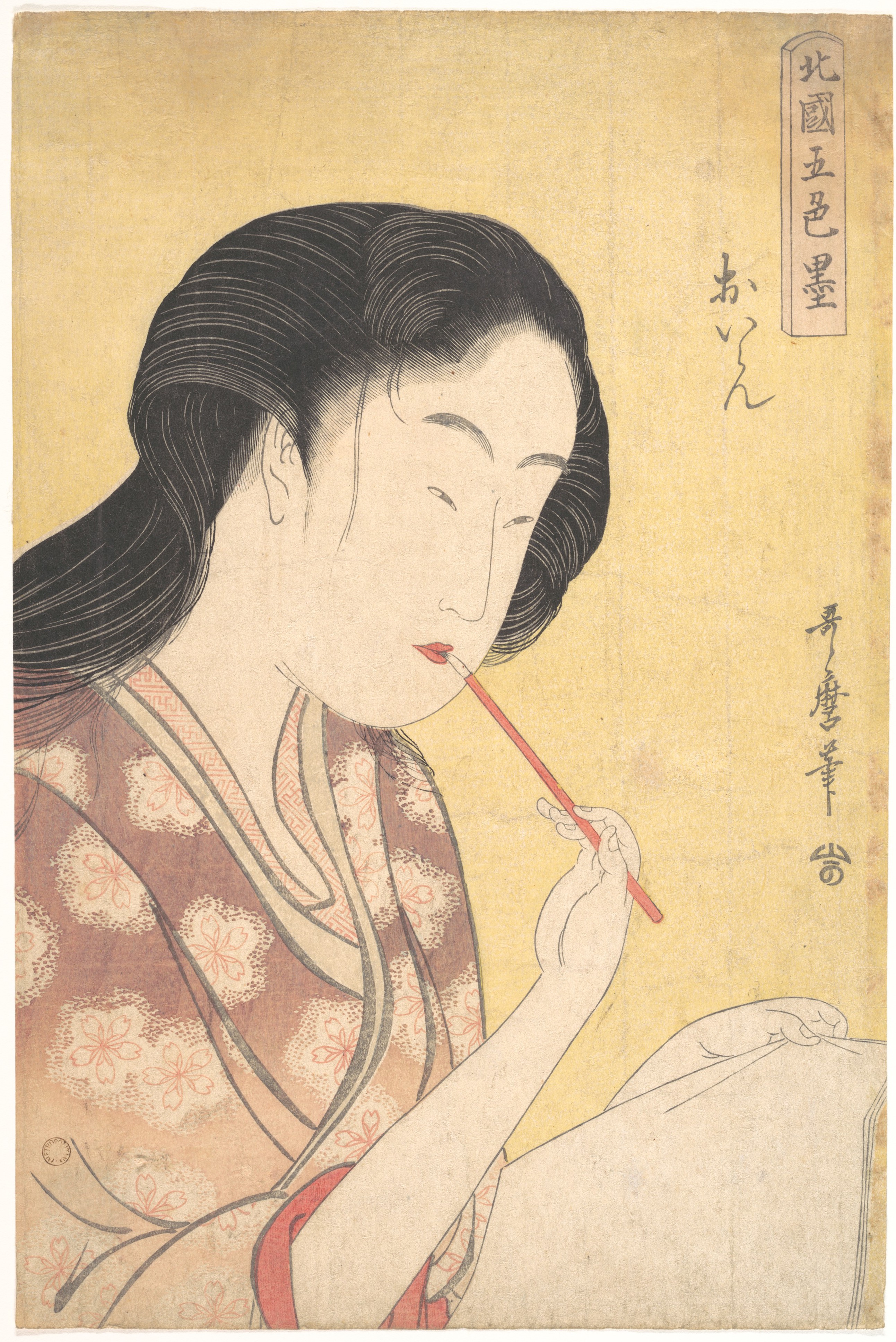
The exhibition's own object credits make the same point about format. Among them is Kitagawa Utamaro's "High-Ranking Courtesan," from the series Five Shades of Ink in the Northern Quarter, 1794–95, which the page describes as a polychrome woodblock print and the Met catalogues under Prints. A commercial sheet, produced in numbers, inside an exhibition about brush writing.
That is the distinction to carry out onto the street. A brushed sign was made once, in one pass; a printed one was produced in numbers. Both are in front of you on an ordinary day, and you will often not be able to tell which is which from the pavement. That is not a failure of looking, and it is worth noticing what the Met does with the same problem: a woodblock print sits among the objects of its brush-writing exhibition. On the museum's own arrangement, a printed sheet is not outside the subject.
It also explains something about how buildings look here. Walking Tokyo for its architecture means walking past a great deal of brushed lettering at eye level, and on some buildings the lettering is the part that has been thought about.
Why the Style Is Always a Choice
The reason a choice is being made at all is that there are models, and the two Met objects in this article sit on opposite sides of that: one names the model it followed, and the other became a model for other people.
The 1257 sutra scroll names what it came from. On the calligrapher's own account it "was modeled after a Song printed book of 1208, which in turn was based on a painted scroll" — and the Met catalogues the object itself under Paintings rather than Calligraphy — reasonably, since the scroll carries thirty-four images and the museum calls it the earliest known painted version, in one handscroll, of this litany. The eleventh-century kana sheet went the other way. The Met classifies that one as Calligraphy and records that it "was long esteemed as an exemplary model of ancient court kana calligraphy" — that is, later calligraphers took it as a model.
One declares its ancestor; the other became one. Neither is a neutral object with a style applied to it afterwards.
So the thing to look for is not the name of a style. It is how much the sheet varies: columns that keep their width against columns that drift, characters that repeat at the same size against characters that swell and shrink. Neither is better, and neither tells you what the writer was copying. But a sheet that stays even has been kept even by somebody, and that much is visible without reading a word of it.
Where to See Japanese Calligraphy in Tokyo
Calligraphy is harder to plan around than a workshop with opening hours, because the displays move. The Tokyo National Museum, in Ueno, is the place to start.
There are two places to look, and the difference between them is how far ahead each is settled. A museum collection turns over on a cycle of weeks and has to be checked against your dates. An open-call exhibition is an annual fixture whose dates are published well in advance.
The Museum: Check the Room, Not the Building
With the museum, the practical advice is not which museum but which page.
Two pages, and the difference between them matters. The change-of-exhibits page states the museum's position plainly: "TNM Collection Exhibitions at Tokyo National Museum are rotated almost every week," with the qualification that "Some works are exhibited for a longer period of time." It lists what has just changed, not what is on.
The page you actually want is the Japanese Gallery listing, which gives every room in the building with what is in it and the dates it runs. When we looked, it showed "Painting and Calligraphy" in Room 18 on the second floor, with a run of about seven weeks. The room is the durable part; the dates on it are not.
That is how specific you can be before you leave home. Read the room listing for your dates, note the rooms rather than the museum, and accept that a display running when this was written may not be running when you arrive — the whole point of the first page is that these things move.
The Open-Call Exhibition, and Its Fixed Dates
The second place is contemporary work rather than collections, and it runs on its own calendar. Nitten, the Japan Fine Arts Exhibition, sets out its own structure in English: it "comprises five art faculties; namely Japanese Style and Western Style Painting, Sculpture, Craft as Art and Sho." Sho is calligraphy, and it is a faculty rather than a sideline. The English page adds that it is "opened for public viewing at The National Art Center, Tokyo"; its Japanese pages put around three thousand works in the hall. It runs in Roppongi in late autumn, for a few weeks, and the edition number and the exact dates are on that page each year.
Those are fixed dates, which makes this the one that either coincides with your trip or does not. If it does, the difference from the museum is the whole point: a collection display shows you what survived, and an open-call exhibition on that scale shows you what a living field currently rewards.
Checking the calendar is the same habit that makes a Tokyo itinerary built around art work at all.
Japanese Art & Museum Experiences
What to Carry Into the Room
Three things worth taking with you, in the order you will need them, and a fourth that only matters once you are planning the trip.
Two scripts, and the difference between them is real — the Met names the script of an eleventh-century sheet in its own catalogue entry. But that entry also calls the writing "elegant" and "flowing," and those are not the same kind of statement. A label bundles a judgement, a description and a classification into one phrase.
The grey is worth reading as well as the black, and so is the order. Where a stroke goes dry is visible; so is which end of it the brush arrived at; so are the intervals between characters and columns, which can be taken in from a distance at which no character is legible.
And it was not always meant to be read easily. Take the Met's formulation from the opening literally — beauty was often the supreme motive, even at the expense of legibility. Reading it is not the assignment; looking at it is.
The last thing is the one that changes a trip, and it is a matter of three different distances. The two Met pieces quoted here are the furthest away: New York. Both entries read "Not on view." You can read the museum on them and see its photographs, but you cannot stand in front of them. Old work in Tokyo is closer than that, and it is closer than the word "preserved" suggests: it is out on a schedule, in a room with a published end date, and it will be something else in that room afterwards.
The nearest thing of all is the work whose place is not settled yet — an open-call exhibition of some three thousand works, hung for a few weeks each autumn, with a calligraphy faculty sitting alongside painting and sculpture. That is not a survival being protected. It is a field deciding, in the year you visit, what is worth hanging, and you can go and disagree with it — which is a different proposition from looking at what has already been decided, and the reason it is worth a day of a trip.

%20of%20the%20Saikoku%2033%20Kannon%20Pilgrimage.webp)